Caution
This document is an English translation of the “freee Accessibility Guidelines.” The normative version of this document is in Japanese, and the English version is informational. The English translation is incomplete, and any links with their link texts left in Japanese are untranslated. Please be aware that there may be inaccuracies in the translation or parts that are outdated.
Size of Radio Buttons And Check Boxes
Last Updated: December 14, 2023
Tags: Form , Target Size
Question / Problem
Should radio buttons and check boxes smaller than 24×24px fail checks 0331 and 0351?

Answer / Conclusion
There is no problem if how they are displayed is not changed from the browser’s default.
Explanation
Checks 0331 and 0351 indicate the conditions for satisfying Guideline Item Sufficiently Large Click/Touch Targets which is based on the Success Criterion 2.5.5 Target Size of WCAG 2.1.
This Level AAA success criterion requires the size of pointer input targets, including checkboxes and radio buttons, to be 44×44px or more. freee, which has many desktop services, finds it difficult to meet the requirement of 44×44px or more, but it is necessary to have some kind of standard, so we have set a standard of 24×24px.
In WCAG 2.2, the latest version of WCAG, Level AA Success Criterion 2.5.8 Target Size (Minimum) has been added, which requires a size of 24×24px or more.
These success criteria have an exception that “The size of the target is determined by the user agent and is not modified by the author.” Therefore, in freee’s guidelines/checklist, those that have not been changed from the browser’s default are excluded. When the check boxes and radio buttons are shown with the browser’s default style, the content author does not owe the responsibility for it, and it can be assumed that the user can change the setting.
There are several ways to determine whether or not the browser’s default has been changed.
If the appearance is clearly different from the MDN checkbox sample or radio button sample , it has been changed.
Use the developer tools to check the page source:
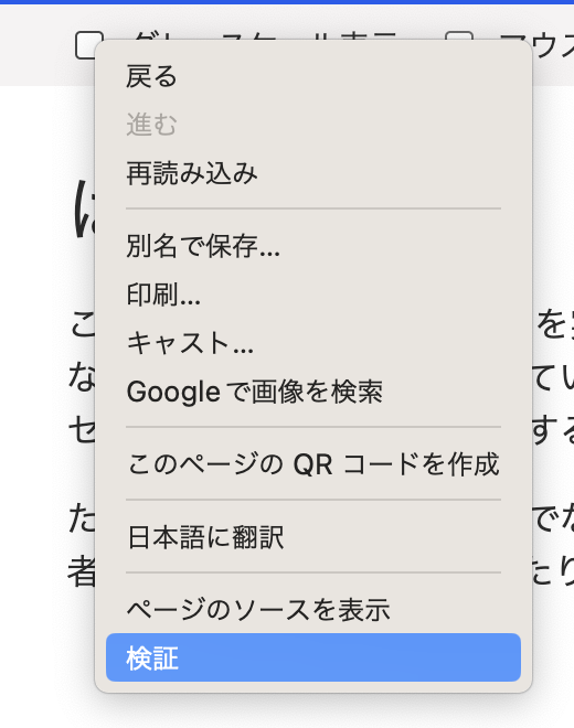
Right-click on the checkbox to open the menu and select “Inspect”.

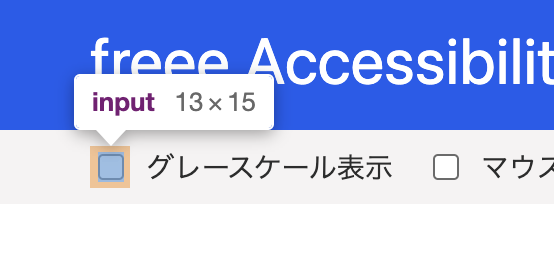
Once the developer tools open, highlight the
inputelement withtype="checkbox".
The checkbox is also highlighted in the rendering area.

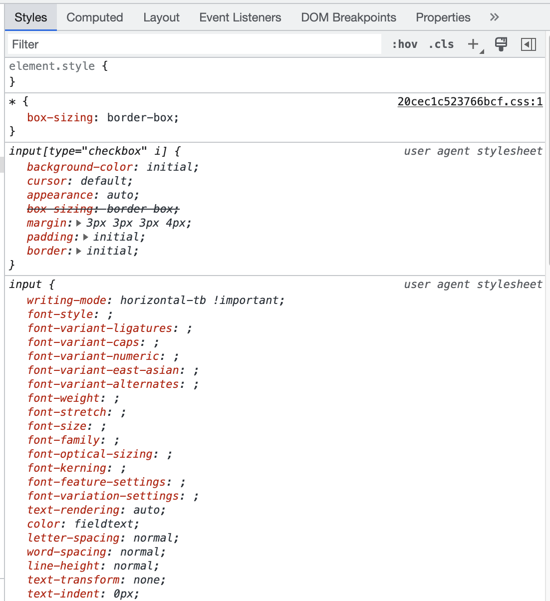
In the Styles panel, check to see if there are any style specifications that change the appearance other than the user agent stylesheet.

In the above screenshot,
box-sizing: border-boxis overwritten, but it is the same as the original specification and does not change the appearance, so there is no problem.
Related FAQs
Related Guidelines
Related Checklist Items
- Check ID: 0331
Images used as buttons or links have a large enough area that responds to clicks and touches, and that area is clearly defined in the design documentation.
- Check ID: 0351
Images used as buttons or links have large enough area that responds to clicks and touches